 |
This slim book of poetry by Auckland judge and poet John Adams marries text and design to create a pleasing whole.
The central conceit of the book is that the reader has stumbled
upon the briefcase of the judge presiding over a domestic violence case. The
text of the novella-length volume comprises both poetry and miscellanea related
to the case: police reports, court transcripts, wills, affidavits, and even two
letter-based Sudoku puzzles. The whole is bound in softcover, and designed to
evoke the briefcase through which the supposed reader supposedly snoops.
|
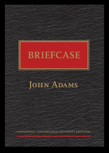
| The front cover |
Briefcase’s cover has been
designed to resemble the object of its title – a briefcase. The leather look of
the cover is printed on to soft card with a slight gloss that reinforces the
highlights of the leather texture image. The title, box, author name, and note
along the bottom are picked out in gold foil – an unusual feature for a book,
where foil is mainly used solely for the author name or title, and then
predominantly within the Romance and SF genres, but which here serves to
reinforce the visual conceit.
Here on the front cover, the only clue as to the nature of the book is a single word in small type at the bottom: ‘CONFIDENTIAL: CONTAINS LEGAL DOCUMENTS AND POEMS’ (emphasis mine). Notably for a book of New Zealand poetry, the front cover does not feature an endorsement. The book relies on the mystery of what the book actually is to draw the browser in, rather than a quote of recommendation.
Here on the front cover, the only clue as to the nature of the book is a single word in small type at the bottom: ‘CONFIDENTIAL: CONTAINS LEGAL DOCUMENTS AND POEMS’ (emphasis mine). Notably for a book of New Zealand poetry, the front cover does not feature an endorsement. The book relies on the mystery of what the book actually is to draw the browser in, rather than a quote of recommendation.
 |
| The back cover |
The
back cover, however, dispenses with (or resolves) the mystery. The background
faux-texture and the use of foil are carried around from the front, but the
layout here does not follow the briefcase aesthetic. The large foil image, to
which the eye is immediately drawn, is distinctly quirky; the blurb, also foil,
outlines the plot of the book.
Overall, the exterior design and production quality have an incongruous effect on one another. The
briefcase design evokes quality: leather, gold, a well-paying white-collar job.
This is undercut by the softcover format that, while not of lower quality than
usual books of this type, is less weighty and evocative of wealth than the
design suggests.
 |
| An example of show-through: the Sudoku puzzle on the next page is visible through the paper. |
The
cover stock is thin card; the interior stock is a lightweight cream paper with
considerable show-through. I originally felt that the book’s design was
undermined by the quality of its paper: a briefcase suggests wealth, while the softcover perfect binding and see-through pages
seem cheap. I have since revised my opinion, or at least come up with
an alternative reading. The thin paper stock may seem at odds with the luxury suggested by the cover design, but it could be
seen to reflect the text’s contents. The text is made up of poems, Sudoku
puzzles, and official reports – the notepaper feel of the paper stock reflects
the piecemeal and often transitory nature of these sorts of texts.
~
All
the elements of Briefcase’s text
(excluding preliminaries) have been specifically laid out to look like
collected notes, or to resemble similar real-world texts.
 |
| Note the 'staple' mark on the inside upper corner of the pages |
Briefcase has no running headers,
footers, or page numbers. Its pages are, however, connected by a grey-line
glyph at the inner top corner of each: a ‘staple’ mark. The absence of
traditional page markers, and repeated use of the ‘staple here’ image, is a
simple but effective contribution to the conceit of the text as a lawyer’s
notes and miscellanea.
 |
| An example of the different ways in which poems are set out |
The
poems are laid out in a variety of ways, set in different sections of pages but
connected by a consistent use of typeface and treatment of headings. The
differing layout styles create interest and keep the overall feel of the text
choppy and disparate, while the connecting elements keep them from appearing entirely
disconnected.
 |
| The Sudoku puzzles |
The
Sudoku puzzles are presented as they might be in a normal puzzle book, and on
their own page, rather than being integrated into the text. This treatment of
the puzzles as a distinct element contributes to the overall feel of the text
as a collection of odds and ends related to the case.
 |
| An example of one of the 'legal documents' of the case |
The
official reports etc. are presented as they might be in actual legal and police
documents.
Overall,
and despite the softcover binding and lightweight paper stock, Briefcase’s exterior and interior design
is successful. Within the limitations of a perfect-bound paperback, the design
cleverly employs deliberate use of colour, images, foil, and typesetting to
allude to the book as an object not a
book. The pun doesn’t hurt, either.
Samples collected 14
June 2012
No comments:
Post a Comment