Welcome to
my design scrapbook. Entries are arranged by book, with examples of various
good and bad design features in each. You can browse through as normal, or use
this contents page to navigate.
Athfield
Architects, Julia Gatley – bindingbinding, chapter heading, colour, cover,
format, half title, hierarchies, images, index, jacket, margins, measure, paper
stock, part title, text, title
Bill
Hammond: Jingle Jangle Morning, Jennifer Hay et al – binding, colour,
cover, images, jacket, margins, paper stock
Bitterblue,
Kristin Cashore – chapter heading, cover, half title page, images, part
title page, title page
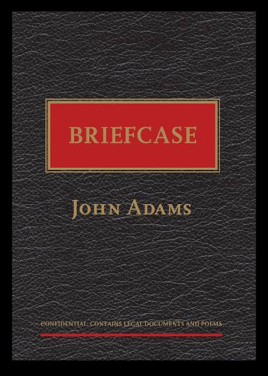
Briefcase,
John Adams – binding, colour, cover, images, paper stock
The
Craftsman, Richard Sennett – colour, cover
Fantastic
Beasts and Where to Find Them, JK Rowling – images, imprint, text
The
Fierce Little Woman and the Wicked Pirate, Joy Cowley and Jo Davies / Joy
Cowley and Sarah Davis – book shape, book size, colour, cover, format,
images, text
Jane
Eyre, Charlotte Bronte (ebook) – book size, chapter heading, colour, cover,
ebook, format, measure, paper stock
Newtons
Sleep, Daniel O’Mahony – chapter heading, cover, half title page, headers and
footers, measure, part title page, title page, text
The
New Zealand Oxford Dictionary – binding, book size, headers and footers,
margins, measure, paper stock, text
Paper
Blossoms, Ray Marshall – book size, book shape, colour, cover, format
Pat
the Zombie, Aaron Ximm and Kaveh Soofi – binding, book shape, book size, colour,
cover, format, images, text
Radical
Skubic Jewelry – binding, colour, cover, images, margins, measure, paper
stock
The
Selected Works of TS Spivet, Reif Larsen – imprint, text
Spineless
Classics – binding, book size, book shape, images, measure, text
There
was an Old Woman, Gavin Bishop – binding, book shape, book size, colour,
margins, paper stock, text
The
Unforgiven Harvest and The Lead Wait, Jo Randerson – colour, cover, headers
and footers, hierarchies, images, margins, part title page, text, title page
I am also
doing an ongoing study of NZ YA Covers in 2011, which can be found here.
I hope to continue updating this through the year as and when I have time, and
perhaps do a follow-up for 2012 releases.