Showing posts with label paper stock. Show all posts

Sunday, July 8, 2012

JANE EYRE on the KINDLE APP FOR ANDROID

The trouble with e-book design is that quite often, it’s not the e-book’s design you are seeing: yes, formatting errors can make a book unreadable, but if an e-book is cleanly formatted and has no or few images, then, depending on your reader, you can practically redesign it yourself.

I don’t own a Kindle, but I do have the Kindle app on my phone. It’s not ideal to read from: the screen is small and back-lit, and I’m forever bumping the screen the wrong way and having to scroll back to my place. Nevertheless, the app provides quite a few options for redesigning an e-book’s text to better fit your device.

Some design elements are immovably formatted into the e-book. For this version of Jane Eyre (which I ‘purchased’ for free from Amazon), these include the cover, line and section breaks, chapter headings, and indented paragraphs.
Jane Eyre, all alone in my Kindle library

Saturday, July 7, 2012

ATHFIELD ARCHITECTS, Julia Gatley


Books about design bear the greatest expectations when it comes to their own design – it’s hard to sell a reader on your subject if you fail to live up to it yourself (and you are a book). Athfield Architects ably lives up to the challenge. This solid coffee-table book has slick design inside and out, with plenty of well-presented images and attention to detail.

BILL HAMMOND: JINGLE JANGLE MORNING, Jennifer Hay et al


This book has one distinctive feature that differentiates it from the other coffee-table art books I have seen: its jacket doubles as a poster but, rather than the poster image being on the inside of the jacket, the poster has been folded so that it creates the jacket cover, complete with title. This is an appealing concept, as the purchaser gets a ‘free’ print of Hammond’s Jingle Jangle Morning to hang on their wall and accompany the book. 

RADICAL SKUBIC JEWELRY


This jewelry art book’s deconstructed design is interesting, but has a negative effect on its presentation of images and heavy text.

THERE WAS AN OLD WOMAN, Gavin Bishop


This board book for toddlers is based on a traditional nursery rhyme, illustrated by Gavin Bishop.

The book’s construction is typical for books aimed at this demographic: square, chunky, small enough for the toddler to turn the thick pages without help, durable enough to withstand enthusiastic gnawing. The corners not attached to the spine are rounded, preventing their use as eye-poking devices and reducing the risk of them becoming worn and frayed over time. 

Friday, July 6, 2012

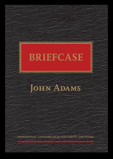
BRIEFCASE, John Adams


This slim book of poetry by Auckland judge and poet John Adams marries text and design to create a pleasing whole.