Showing posts with label images. Show all posts

Sunday, July 8, 2012

BITTERBLUE, Kristen Cashore


This is a beautiful book with gorgeous design. The jacket cover is fairly generic-YA-fantasy, but hidden inside are some of my favourite bits of design in this whole scrapbook.

FANTASTIC BEASTS AND WHERE TO FIND THEM, JK Rowling


Fantastic Beasts and Where to Find Them is a companion to the Harry Potter books. It purports to be Harry’s copy of the book, and contains a variety of annotations and doodles ‘written’ by him, Ron and Hermione. The annotations are handwritten - a normal typeface really wouldn't work for this sort of feature.

As this is a textbook, not all of the additions are relevant to the text...

SPINELESS CLASSICS

These books have the most cunning binding of all - none!

Spineless Classics are posters that contain the entire text of classic works of literature, cunningly set so that the text creates a silhouetted shape related to the book. They are primarily meant as decoration, rather than to be read, but it is possible to read them if you don't mind climbing a wall and squinting at them. I will focus on their design, both how well it looks and how it relates to the book's content.

As with all endeavours, some are more successful than others.

... I'm going to try really hard not to just repost their entire list, but bear with me. Here goes:

Peter Pan, 700x1000mm

Saturday, July 7, 2012

PAT THE ZOMBIE, Aaron Ximm and Kaveh Soofi

Like Paper Blossoms, Pat the Zombie uses a children’s book format in a book for an adult audience. Pat the Zombie is a parody of children’s tactile books; a ‘cruel adult spoof’, as it styles itself. The book’s design aesthetic successfully mimics the spoofed genre, but poor production means Pat the Zombie the book looks even tackier than its premise promises. Sadly, Pat the Zombie fails where Paper Blossoms succeeded. Both tactile and pop-up books require design and construction to work together, but Pat the Zombie’s design fails to take into account the limitations of its construction, and its construction is flimsy and poorly designed.

Pat the Zombie in its presentation box. 

THE UNFORGIVEN HARVEST and THE LEAD WAIT, Jo Randerson


This book contains two plays by playwright Jo Randerson. It was published by PlayMarket as part of their ongoing New Zealand Play Series. 

Front cover

THE FIERCE LITTLE WOMAN AND THE WICKED PIRATE, Joy Cowley and Jo Davies / Joy Cowley and Sarah Davis


This post is a bit of compare-and-contrast between the 1984 and 2010 versions of Joy Cowley’s The Fierce Little Woman and the Wicked Pirate. This story was originally published by Shortland Publications Limited with illustrations by Jo Davies, and in 2010 was republished by Gecko Press in a new format, with new illustrations by Sarah Davis. Overall, Gecko Press’ edition has far higher production quality and a superior design, creating a far more appealing book.


ATHFIELD ARCHITECTS, Julia Gatley


Books about design bear the greatest expectations when it comes to their own design – it’s hard to sell a reader on your subject if you fail to live up to it yourself (and you are a book). Athfield Architects ably lives up to the challenge. This solid coffee-table book has slick design inside and out, with plenty of well-presented images and attention to detail.

BILL HAMMOND: JINGLE JANGLE MORNING, Jennifer Hay et al


This book has one distinctive feature that differentiates it from the other coffee-table art books I have seen: its jacket doubles as a poster but, rather than the poster image being on the inside of the jacket, the poster has been folded so that it creates the jacket cover, complete with title. This is an appealing concept, as the purchaser gets a ‘free’ print of Hammond’s Jingle Jangle Morning to hang on their wall and accompany the book. 

RADICAL SKUBIC JEWELRY


This jewelry art book’s deconstructed design is interesting, but has a negative effect on its presentation of images and heavy text.

Friday, July 6, 2012

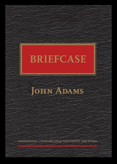
BRIEFCASE, John Adams


This slim book of poetry by Auckland judge and poet John Adams marries text and design to create a pleasing whole.